# Dashboard & Competency Breakdown
Clinc’s Analytics Dashboard provides insights into end-user behavior and AI model performance. It’s a summary of the entire deployment across all users and integrated channels. A user without the necessary Permissions will only be able view the dashboard.
The Clinc dashboard offers a quick way to see basic statistics about users, user queries, and performance. Users can also view graphs that plot latency, out of scope queries, and more. Logs can be exported as reports allowing users to perform their own data analysis.
# Dashboard
# Filters
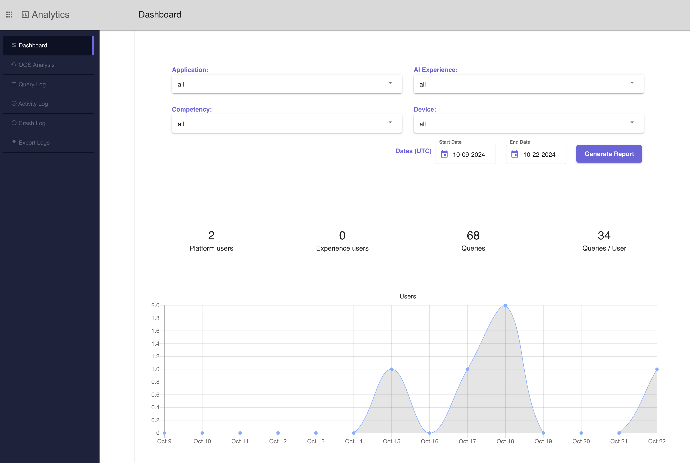
The filters are applied in order with respect to the following heirarchy: Application, Experience, Competency, and Device. In the example screenshot below, there is an application selected and the AI Experiences dropdown is expanded, only showing experiences associated with the application. Competencies dropdowns should only have values corresponding with remaining experiences and devices dropdown should only have values corresponding with remaining competency values. If any value is changed, the values below it in the heirarchy will be reset to the value 'all'.

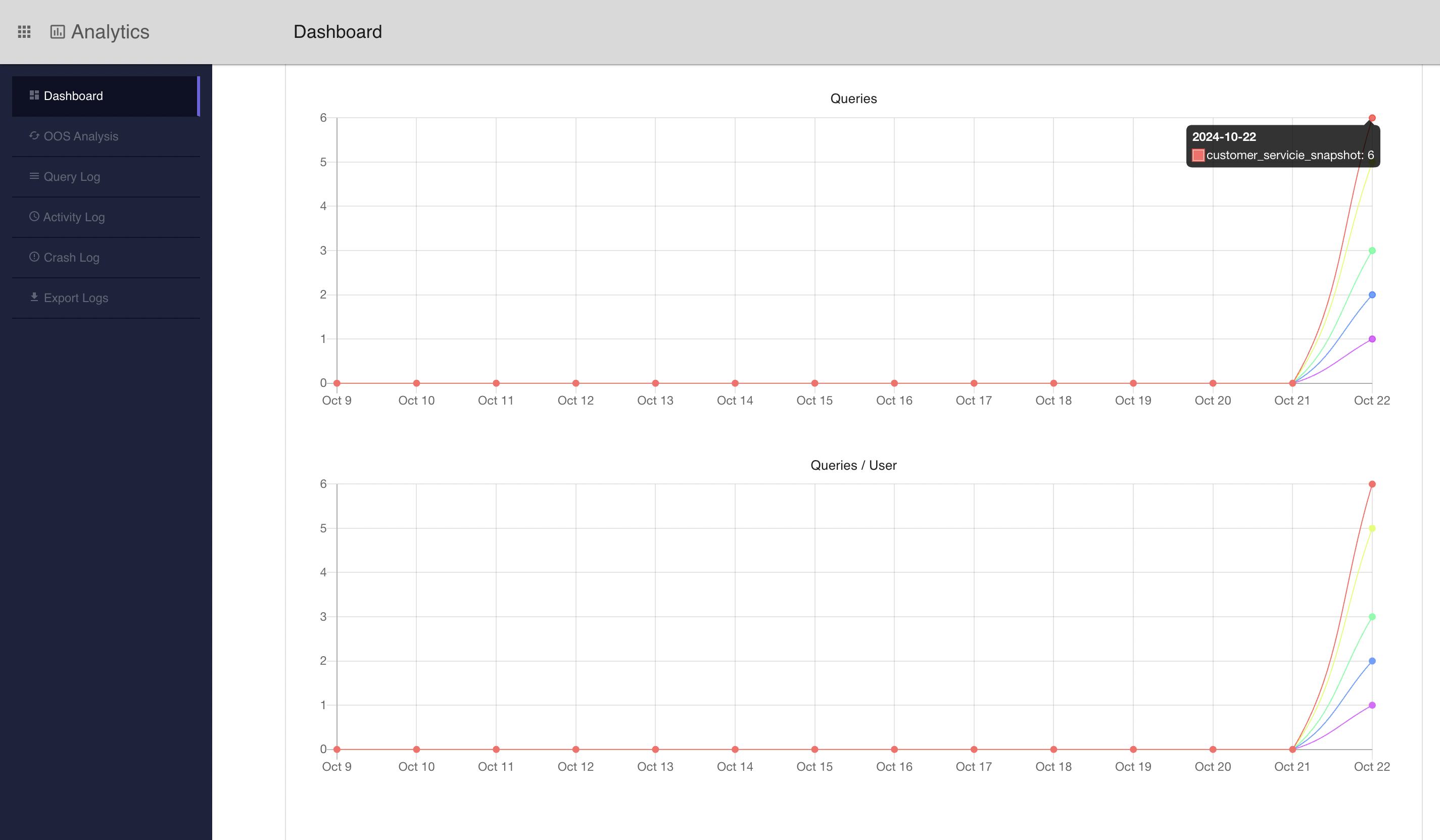
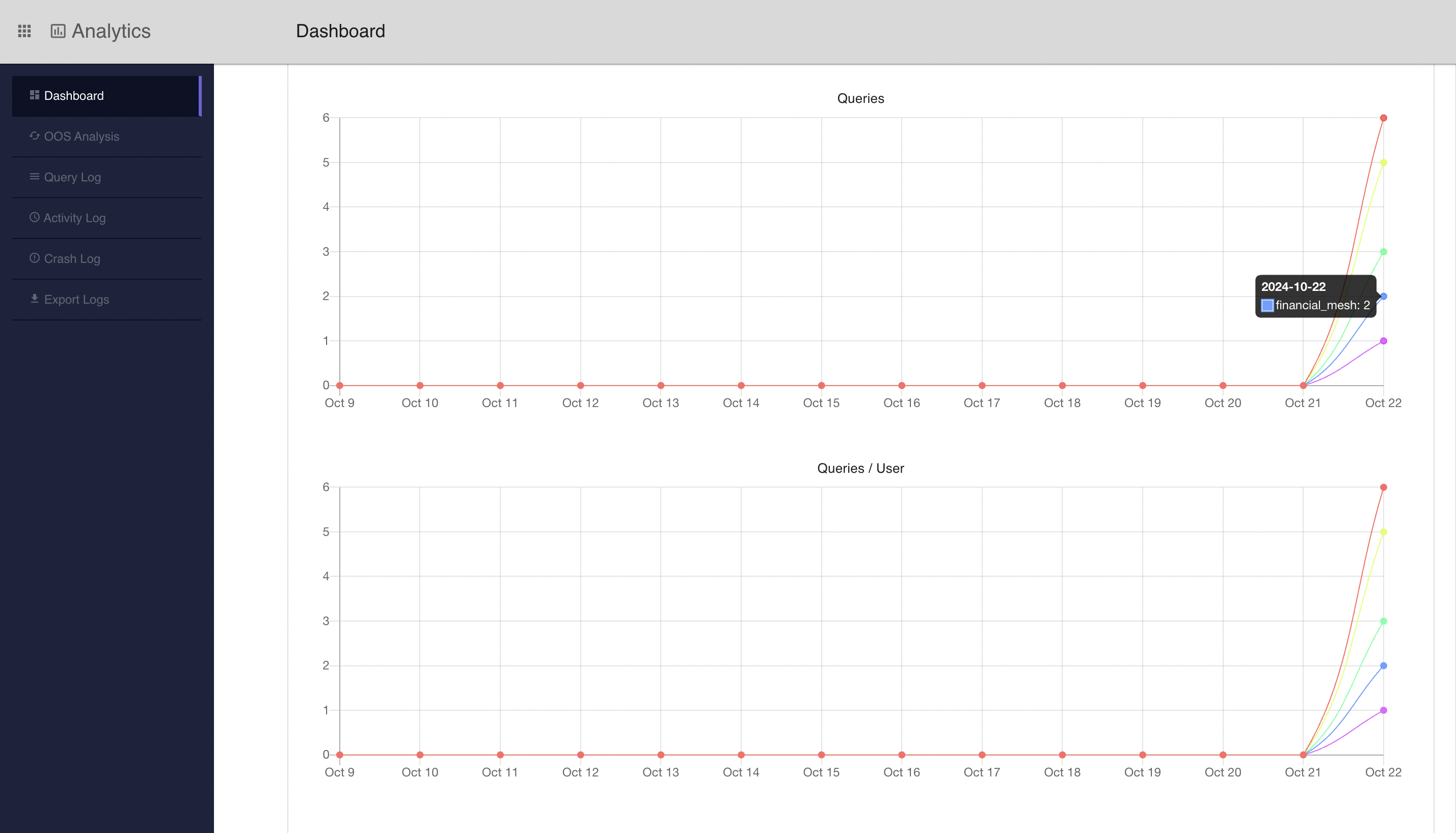
- Application: This value filters data by a specific application. If multiple experiences were queried through a singular application, the dashboard will display individual lines to represent each experience. If a user hovers on the line, the name of the experience will be displayed. This behavior is shown in the graph screenshots below.
- Experience: Clinc offers three types of AI Experience: AI Versions, Bot Orchestrations, and AI FAQ Collections. Use this filter to select a specific experience.
- Competency: Filters to queries classifying to states within the specified competency.
- Device: Filters by queries quiered through a specific channel.
- Date Range: Filter by a specific date range.
# Top Level Metrics
On the Clinc dashboard UI, underneath the filters, there are four different metrics provided to the user. Refer back to the first screenshot for a quick look at the statistics provided or see the summary below.
- Platform users: Number of users who have used the platform during the selected time period.
- Experience users: Number of end-users who have sent queries to AI projects on the platform.
- Queries: Number of total queries during the selected time period.
- Queries per unique user: The average number of queries per user during the selected time period.
# Graphs
The Clinc dashboard UI provides graph visualizations of a few different statistics over a selected period of time. This includes data about users, queries, out of scope responses, and performance. See the list below for a definition of what each graph represents on the Clinc dashboard.
- Users: Presents the trends in the number of unique users over the selected time period.
- Queries: Presents the number of queries to the platform.
- Queries per user: Presents the average number of queries per user per day.
- Competency breakdown: Presents a breakdown of competencies usage. Hovering over a piece of the pie charts will display the total number of queries for that competency.
- Out-of-scope responses: Presents the queries that were not understood by the AI model. Out-of-scope is defined as being below a certain threshold of confidence.
- Average response latency by competency (Seconds): Presents a bar chart depicting average latency in seconds for each competency.
- Latency histogram: Presents a histogram of the latencies of the queries in the system.
Graphs only associated with one or no application selected and one experience selected will be represented as one line, as seen in the screenshot above. However, if there are multiple experiences associated with a single application, then a series graph with multiple lines each representing an individual experience will be shown. Hover over a line to see the associated experience. See the screenshot below:
# Generate Report
The platform enables users to generate a CSV report of end-user statistics. You can use this feature in tandem with the filters to summarize by applications, experiences, competencies, devices, and time period.
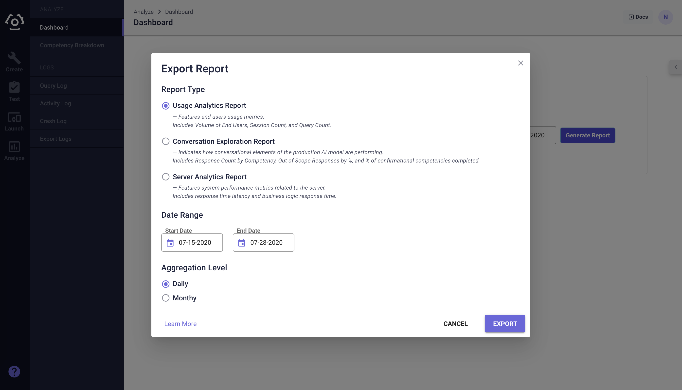
There are three types of reports available and a user has the option to aggregate daily or monthly:
# Usage Analytics Report
- Volume of Platform Users
- Volume of External Users
- Query Count
- Session Count
# Conversation Exploration Report
- OOS (Out-of-scope) Responses %
- Competency (Breakdown) Name
- Competency (Breakdown) Response Count
# Server Analytics Report
- Competency Name
- Average Query to Response Latency by Competency (in Milliseconds)
- Average Business Logic Response Time by Competency (in Milliseconds)
Last updated: 10/24/2024